News
Rachid Photo: Stills+Motion Website Re-Design
Around Mid-April my friend Rachid called me up to discuss a few issues that he was encountering with his website.
When Rachid first contracted me to build his website in 2010 his main focus was to create an ecommerce website where the general public could browse his portfolio and custom order any image in a variety of size and framing options. In that aspect the website was a success.
The problem that he was facing was that although individuals could easily purchase his images, his editorial and commercial clients were dwindling. He soon discovered that magazine editors and creative directors visiting his website for a quick sampling of his best work were finding themselves overwhelmed and as a result would move on to the next photographers portfolio. So the question became; how do you strike a balance between running a lucrative B2C ecommerce website with all the bells and whistles while also catering to a very specific B2B clientele who only want to see a bare bones best of the best portfolio?
After some brainstorming we decided that the best plan of action would be to split the website into two individual sites or "portals" as we began to call them. His already existing ecommerce website which we named "Fine Art Prints" was given a light visual refresh. The aesthetic refresh was needed in order to keep the Rachid Photo branding consistent across the two portals and although the aesthetics were updated, all of the core site functionality remained intact and unchanged.
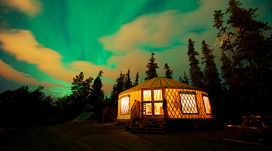
For the new portfolio portal, titled "Stills+Motion," Rachid's images needed to be the main focus and fill as much of the viewers screen as possible regardless of the viewers browser window or device viewport size. A special requirement that Rachid had was to make sure that his images were never cropped nor would require scrolling to view them in full. This created quite a challenge from a programing and developmental standpoint. Using standard CSS3 properties it is easy enough to create a fully responsive website that would prevent horizontal scrolling and ensure that all images were never wider than the browser window or device viewport. However, CSS is extremely limited in its ability to scale image height while preserving image aspect ratio and preventing horizontal scrolling, especially when working with a jQuery slideshow containing a random combination of landscape and portrait images. I was able to solve this unique problem by writing some custom Javascript that compares the available window/viewport size to the opening image dimensions when the page is loaded or when the page is resized. If the image height or width dimensions are greater than their respective window/viewport counterparts then the image is resized respectively. Check out www.rachidphoto.com to view the live site in action.
Overall, Rachid is very happy with the solution we came up with and has since reported that he has been receiving a lot of positive response from his editorial and commercial clients.
Comments
There are no comments for this entry yet.
Add a New Comment
SEARCH
CALENDER
| << | June 2026 | |||||
|---|---|---|---|---|---|---|
| S | M | T | W | T | F | S |
| 1 | 2 | 3 | 4 | 5 | 6 | |
| 7 | 8 | 9 | 10 | 11 | 12 | 13 |
| 14 | 15 | 16 | 17 | 18 | 19 | 20 |
| 21 | 22 | 23 | 24 | 25 | 26 | 27 |
| 28 | 29 | 30 | ||||